I’ve been thinking a good deal about book covers lately. Probably more than is good for me, if I’m honest. That old saying about not judging a book by its cover doesn’t hold much water when it comes to potential readers making a quick decision on whether to pick up your book or not.
One of the things that keeps coming up in the research I’ve been doing is that you should be able to identify the genre immediately. OK, some covers helpfully have ‘a thriller’ written on them. Some of mine simply say ‘a novel’ although I’m not sure if anyone would mistake them for self-help or a travel guide.
Whether your book cover has an illustration or a photograph, which colours predominate, which fonts and how large they feature, are all interesting subjects for study.
With this in mind I decided to put together a selection of covers from my fellow Murder Is Everywhere blogmates’ work and see what you thought of them.
First up is Annamaria Alfieri, who writes historical mystery novels set both in Africa and in South America.
I have to confess that BLOOD TANGO is one of my favourites. That dashing title and single splash of red on the figure is very evocative. For THE IDOL OF MOMBASA you can tell the era from the typeface and the colourway, never mind the style of dress. Although in different styles, both covers feature a border that looks more like a frame.
Cara Black is the author of the mystery series featuring private detective Aimée Leduc. Each novel is set in a different area of Paris.
The cover designs are consistent and stylish right the way across the series, although it might be hard for someone new to Cara’s work to pin down the era in which they’re set.
The two covers I’ve picked from Leye Adenle’s novels show the breadth of his writing.
EASY MOTION TOURIST is a fast-paced thriller with in-your-face contrasting colours. THE BEAUTIFUL SIDE OF THE MOON has a more fantasy edge. The book is described as ‘drawing on age-old African story-telling traditions, modern sci-fi, and contemporary thriller writing.’
Like Annamaria, Sujata Massey sets her novels on two very distinct and different continents—in this case, India and Japan.
Her Indian series features attorney, Perveen Mistry, and the books are set in 1920s’ Bombay. The covers are illustrations rather than photographs, rich in colour. Her contemporary Japanese series features English teacher and antiques buyer, Rei Shimura. The cover designs for this series have changed quite a bit from book to book. THE KIZUNA COAST is the latest to be published.
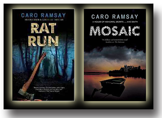
Caro Ramsay has been writing the Anderson and Costello police procedurals for a while now, and RAT RUN is one of that series. With the bold san serif type, shadowy figure and the axe—not to mention the names of the continuing characters on the cover—readers won’t be in much doubt about the genre.
For her next novel, however, Caro has written a standalone, MOSAIC, which has an intriguing, atmospheric cover and great font for the title.
Michael Sears and Stan Trollip—better known collectively as Michael Stanley—also write a police procedural series and have just penned a standalone.
The Detective Kubu series is set in Africa. The bold colours, cover style and typeface of DYING TO LIVE make it somehow obvious that these books are not set in Detroit or Manchester.
They have also written a standalone featuring investigative journalist Crystal Nguyen, which is called SHOOT THE BASTARDS in the US and DEAD OF NIGHT in the UK and South Africa. The covers for both editions are very different from their Kubu books, with hot orange and yellows, sans serif font, and a female figure.
Jeffrey Siger sets his crime thrillers featuring Chief Inspector Andreas Kaldis in Greece.
The book covers have a strong series identity, with very bold typeface to ensure the reader doesn’t mistake the beautiful scenery in the photographs for some less hard-boiled fare. THE MYKONOS MOB is the latest in the series, although it’s not the first time Jeff has used this location for one of his storylines.
Japan is also the setting for the books by Susan Spann. These feature master ninja Hiro Hattori and Portuguese Jesuit Father Mateo and are set in the mid-1500s.
The cover designs confused me a little, as the first three and the sixth one, CLAWS OF THE CAT, are red typeface on black, with a series of striking images to ring the changes. However, the other two, including BLADE OF THE SAMURAI, are quite different so that I initially thought there were two different series running side-by-side.
That only leaves yours truly. The cover designs for my Charlie Fox series have been many and varied. Here’s a taste of the different ones just for the first novel, KILLER INSTINCT. And I’m in the midst of planning a redesign as we speak…
So, for you, what’s the most important thing about the covers for your own work, or those you like to read? What attracts you and what puts you off?
This week’s Word of the Week is momentarily, which is one of those words with different meanings depending on which side of the Atlantic you happen to be on at the time. In the UK, it means for a very short time. If you pause momentarily, you do so only briefly. If the captain of the US flight you’re on announces that you’ll be landing momentarily, he or she means soon, not a quick touch-and-go bounce on the runway.
May 2
NOIR AT THE BAR NEWCASTLE—the Town Wall pub, Pink Lane, Newcastle NE1 5HX
Doors open 19:00
Organised by the inimitable Vic Watson, the line-up is Neil Broadfoot, Mik Brown, Ashley Erwin, Derek Farrell, Jónína Leósdóttir, Gytha Lodge, Judith O’Reilly, Zoë Sharp, Lilja Sigurðardóttir, plus a wildcard chosen on the night.
May 9-12
CRIMEFEST INTERNATIONAL CRIME FICTION CONVENTION—Mercure Bristol Grand Hotel, Bristol
Friday, May 10, 13:40-14:30 Contemporary Issues: Reflecting How We Live Candy Denman, Paul Gitsham, Cara Hunter, Amanda Robson, Zoë Sharp (Participating Moderator)
Saturday, May 11, 11:20-12:10 Ten Year Stretch: The CrimeFest Short Story Anthology Peter Guttridge, Caro Ramsay, Zoë Sharp, Michael Stanley (Stan Trollip), Kate Ellis (Participating Moderator)
Sunday, May 12, 09:30-10:20 The Indie Alternative Beate Boeker, Stephen Collier, Barry Faulkner, Lynn Florkiewicz, Zoë Sharp (Participating Moderator)
June 7
Meet the Author—Thornton Library, Victoria Road East, Thornton Cleveleys, Lancashire FY5 3SZ
Friday, June 07, 10:30-11:30


Yep, you sure do have us covered! Thanks, Zoë, for the time you put into making us all look good. Can't wait to see you at CrimeFest. As for covers in general, I think they generally follow a format that publishers see as designating a genre, most evident in the "bodice rippers." It will be interesting to see what style of cover shakes up the current norms. Perhaps your new one will do it!
ReplyDeleteThanks, Jeff. I think you can shake up the norms when you're something new or have a publisher who's putting a lot of weight behind you. Otherwise, you just want to reassure the reader that they know what they're getting is what they're likely to enjoy.
DeleteLooking forward to seeing you in Bristol, also!
When Penguin republished my first four books, the covers were all actually the same background; birds in the sky were in the same place, trees in the same place. Then they superimposed a cottage, a pond, some more trees and some more birds. That was fine until you put them on a shelf spine out. They were just in same but different colours!
ReplyDeleteHi Caro. Yeah, after the first book, my publisher went for a broken glass theme for the next two books. As you said: the same but different colours.
ReplyDeleteThis is timely for me, Zoe. My agent and I are working on new covers for the audio version of Idol of Mombasa and The Blasphemers. The graphic artist sent us suggested illustrations where a female character was wearing a heavy overcoat. At the equator!!
ReplyDeleteSo here’s my question: does the graphic artist ever actually read even a synopsis of the story? ��
A most interesting post. I am still old-school and purchase and read paperbacks and I have to admit, it is often the cover that catches my attention. . .much like a label on a wine bottle.
ReplyDelete