|
| The city of George with the Outeniqua Mountains |
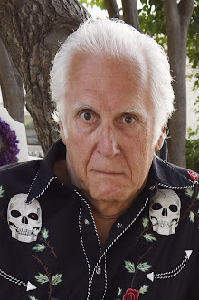
Andre Louw is a man of
many talents. He’s a guitarist, but he missed out on rock star fame so he
turned to law. He qualified as an attorney in 2000, received a PhD in Law in
2010, and now teaches at Stellenbosch University. His fascination with
corruption and his love of reading mysteries led him to try his hand at fiction,
and that led to not one debut novel, but two! The first, titled Phantom
Pass, was published in February by Catalyst
Press.
I was very intrigued
to discover this story set on the Garden Route on the Cape coast, the area
where I live. Phantom Pass itself is about half an hour’s drive from my house. And,
indeed, the book has a strong sense of place and an authentic feel. I was keen
to learn how Andre came to write the book. And his story has important messages
for anyone setting out to write fiction.
So it’s a great pleasure
to welcome him to Murder Is Everywhere
for today’s guest post.
Michael
 |
| Andre Louw |
From a young age I’ve had a great love of books – my mom
engraved that on my psyche and injected it into my DNA from early on - and I
always wanted to write a book, my own book. Just one.
For my day job I have, over the years, written two published
books and a number of academic articles. I knew that I could write. But I
didn’t know if I could write this:
Fiction.
I would, on one or two occasions over the years, set out to
try. Just a very few pages, one scene at a time. But that never worked. It
never stuck. I guess I wasn’t yet ready for so big a task as creating a world
filled with fictional persons with imperfections and problems, triumphs and
emotions. For the mammoth task of spinning a yarn that someone would like to
read to the end.
I did, though, get the impression that I might be
able to do it, once I set my mind to actually just knuckling down and trying.
Keeping at it for more than 30 minutes at a time, and then not immediately chucking
the text because it lacked stuff (whatever stuff that was).
Then it eventually happened in 2019. I remember the actual
day:
19 November 2019, a Friday evening.
I was 47 years old.
Wow, later in life than I thought it would ever happen, but
better late than never, right?
I decided to write one scene for a crime thriller, the first
one: The discovery of a body.
Ooh, sexy! Right?
Right!
I did it. And I loved it. And I kept writing.
But not for long, just till I came to around page 30, when I
realized that, as much as I loved the experience so far, I had no bloody idea
where to go from there, nothing.
Nothing.
I had not plotted anything out, and, frankly, I had never
planned for this to turn into an actual book. But I was there now, at last. And
I decided: I was not gonna let that keep me down this time.
I am really proud of myself for that very small thing: To,
just at that moment, decide that I would keep going; I would MAKE it work.
So, I set out to do it.
I spent 2-3 weeks just plotting; thinking about the story
and where I wanted it to go, and what I wanted to say. And then I started
writing.
My writing hours, for most days over the six months I spent
on it, were from 22h00 to 02h00, most if not all nights. Quiet time, dark and
no interruptions. And hey, I’d usually have a whiskey or two in the process. My
muse. I loved it.
It feels very strange to say this, like some form of
blasphemy, but for my book the coming of COVID-19 was a bit of a blessing. Just
over 3 months after I started, South Africa was under a hard lockdown. Working
remotely from home helped me manage my time to write.
It worked (I think).
I finished the first book in six months. And then, realizing
that I had to split the work into two books and move some stuff around for that
purpose – I was told that nobody would buy a debut novel by an unknown
writer that ran to 250 000 words - the last 10 chapters of book two
took me another couple of months. All in all, the book(s) were done in around 9
months.
I felt great. I felt proud.
And then I tried to get it published …
And everything came crashing down, hard.
I had from early on in the process wanted to self-publish. I
spent nearly a year researching the publishing industry and self-publishing.
During this time I lost my nerve to do things myself, as I realized I did not
have the financial resources or the time to manage the whole process of getting
the book into readers’ hands.
So then I started submitting the book to publishers, both in
South Africa and elsewhere. There was no interest. Just the rate of (negative
but mostly well-wishing) replies was probably less than 1%.
This was so demoralizing that I eventually put the book
away.
Having done some soul-searching I realized that I had built
up the expectation in my mind to a dangerous level. I now started to become
depressed. The third book and the fourth, both of which I had started writing
while I was seeking a publisher for the first, were shelved. I simply couldn’t
write anymore.
What was the point?
Somewhere in 2022 an independent American publisher,
Catalyst Press, read the book. They declined to sign it up, citing reasons
relating to another title they had upcoming. One of their editors, SarahBelle
Selig – by far my favourite person in the publishing industry – managed to
break my heart in the nicest way. She raved about the book and the writing.
So, around late 2023 I thought, what the heck, let’s try
again, and I once again asked them to consider it. On 6 May 2024, the day after
my birthday, I signed the publishing contract with Catalyst for Phantom Pass
and Chasing Ghosts (out mid-2026).
Yes, I googled it:
 |
| Phantom Pass |
That was 1 630 days from that evening when I had put
the first words to paper, describing the discovery of the mutilated body of
Mark Whitcombe in a little rust-red-coloured boat floating on a cold estuary
under grey, darkening skies. That image was the seed of everything.
From it, grew the two-book murder investigation set in Knysna on the Garden Route of
South Africa. Capt. Josh Holland, a trainee detective with a background in
law, is thrown into the chase under the wing of the experienced Colonel
Gavin Whitall from the South African Police Service’s Serious Crimes Unit in
George, after the mutilated body of a prominent retired advocate is found in a
small boat on the Knysna estuary.
The
investigating team encounters a number of suspects, including a former
apartheid security police operative and a notorious local drug dealer. As the
investigation expands the detectives realize that the fate of their victim
appears to be linked to a murder committed in Mozambique in 1986, in the
shadowy world of the African National Congress’s armed struggle. The team wades
through a highly politicized police bureaucracy and grapples with high stakes
political corruption, as they stalk a killer across the southern Cape and
beyond South Africa’s borders. All the while the body count stacks up, as prey
becomes hunter and death comes uncomfortably close.
1 630
days from a body in a boat to a signed contract.
Thinking back on it now, it is hard to fathom just how long
this story has been a part of my life. Impossible to try and calculate the
importance and role of its presence in the back of my mind; how it may have
changed me, my relationships, my professional life, and my overall conception
of myself as a person.
But, then again, I have also realized that it always will be
a major part of my life. Regardless of whether it will sell and be a commercial
or popular success. Maybe that stuff is just fluff?
It will always be there because it is something – like a
child - that did not exist in the universe before I came along. Something I
created, and of which I am personally, immensely proud. I know many people
dream of doing this, and few manage to do it.
It is not Hemingway, Steinbeck, Irving or King. It is
definitely not Larsson.
It is (just) me.