 |
| photo by Sarah Kinney Gaventa at Sherman's Books |
Take a good look at this picture of the shelves in Sherman's Books, an indy bookstore in Bar Harbor, Maine. The hand-written sign above the book display reads:
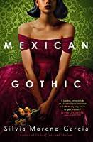
WOMEN IN PERIOD COSTUME FACING AWAY
It's picture that's been shared, and reshaped, among Facebook friends this week. We laugh amongst ourselves because a lot of our books are just like this, featuring ladies looking away. And that raised a question I'm trying to answer for myself. What is it that drives publishing house art departments to almost universally introduce women characters from behind?
My first thought is the image is meant to proclaim the book is trade fiction. Mass market historical romances show faces and bosoms of women--often locked in embrace with dashing men.
There's also the point of universal appeal. An editor told me that readers can have strong personal reactions to faces. Readers might turn away from a book if a face doesn’t appeal. They are less likely to read a book if the cover model’s face—whether photographed, painted or sketched—is dislikable to them.
This brings up the idea of bias. Are we prejudiced against people who are too pretty or too young—or not pretty enough? Do we like to see a protagonist who could be our peer and friend? Do we make subconscious connections between photographs and drawings to real people in our past?
 |
| Two Andrew Davidson book jackets: mine and Jaqueline Winspear's |
My Perveen Mistry series books feature covers designed for the Soho Press by an artist named Andrew Davidson, who also does the covers for Jacqueline Winspear's Maisie Dobbs novels (which also started at Soho, but now are published by HarperCollins). Davidson is brilliant at producing a cover that has the same stylistic feel and dimensions as commercial art from the 1920s and 1930s. And another great part of this artist's process is that he requests examples of clothing, hats, and buildings. I've sent photographs and film clips and closeups from textile museum catalogs. Cover consultation is one of the rights in my book contracts, and I enjoy the collaboration. One part of the design process is me providing illustrations of clothing and hats for my characters, and other period touches. I have cover consultation as one of the rights in my contract, and I'm really glad for it.
Perveen Mistry novels inother countries may reproduce the same covers from Soho Press, while other international publishers have artists draw designs they consider better suited for their own markets. In Australia and India, Perveen Mistry reveals both body and face--properly clad, of course. And something of note: in Australia, Perveen is brown. In India, she's golden.
 |
| Penguin India Cover |
 |
| Allen&Unwin Australia cover |
Another cover trend in so-called women's fiction is a partial view of women's faces. I notice this often when the books feature characters of color.
And speaking of men . . . we all know that many character-driven historic and contemporary novels feature male heroes. Yet where are the manly eyes, noses, and beards? These book jackets don't show faces--just abstract designs, boats, bridges, mountains, imposing buildings, freeways, streets, alleys, cars, and machinery.
Sigh. Sometimes it feels like we never left kindergarten. And because it is 2021, I am putting out the call for male authors to ask their publishers to put men on book jackets. It seems fitting that everyone get the same chance for pranking in bookstores.


I would certainly like to see women's faces on covers, not backs or sides.
ReplyDeleteI've read that publishers think women won't read books if they don't like the way women look on covers, especially if they don't look like them. Is this true? Or women want to imagine themselves as the heroines?
So interesting. I have just had a cover made for my new book WOLFMAN due out soon. Ssssh...it has a woman on the cover facing away!
ReplyDeleteOnly one of my books has a woman in period costume looking away, Sujata. That was Blood Tango in 2013. I guess that cover designer, for St. Martin’s Press, was ahead of his time. Strange God’s original cover has a Maasai man looking away. I wonder what the Pondens would make of that?
ReplyDeleteFor my new kindle deal the publisher has the same girl in a red raincoat walking away on all the covers...which is a case in point.
ReplyDeleteYes. Why can't women's faces be shown? It is weird.
ReplyDeleteI sense I'm not alone in never having thought about this before you raised the point, Sujata. As my series is directed at specific locales in Greece, Poisoned Pen Press (now part of Sourcebooks) only employed images of place, not people, on my covers. I doubt that's going to change.
ReplyDelete